Want More of
Two Hands?
Get The Rub, our newsletter,
directly in your inbox.
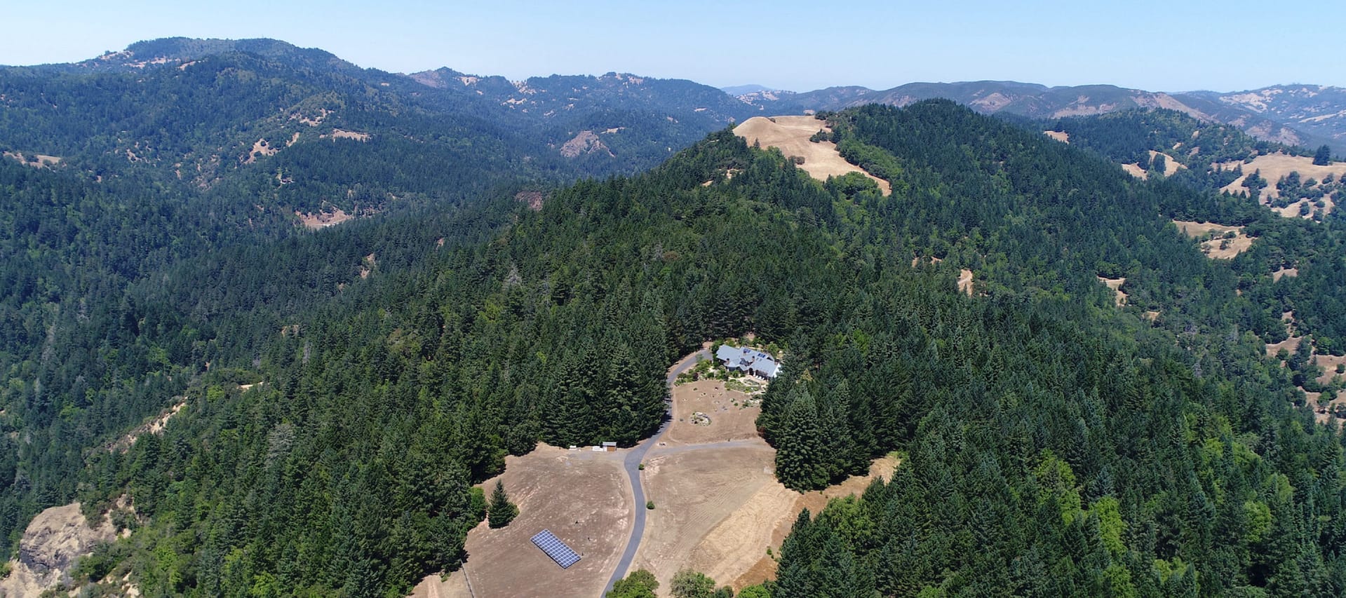
The owners of Teravana, a pristine nature retreat in Sonoma, CA, needed help defining their concept and hierarchy of related nonprofits.
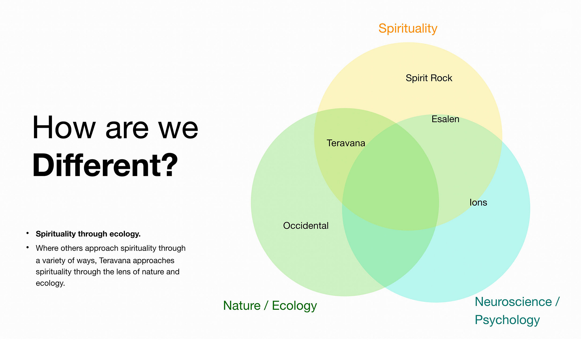
With market research and product thinking, we helped them differentiate, and create a concept that is both dear to their hearts, and highly attractive to their market: healing people through healing the planet. We have an ongoing relationship helping them develop more on-brand products and events.

We learned that Teravana has a robust ecology and forestry program, in order to take care of their 640 wild acres, and the founders are passionate about nurturing the environment and being stewards of the land. In order to differentiate from the Esalens, Kripalus, and Spirit Rocks of the world, ecology was a clear differentiator to weave into their tapestry.

For the Visual Identity, we partnered with our good friends at Quick Brown Fox, masters in artful branding.
The Logo pairs a tasteful reverse-tapered typeface with a hand-drawn v, suggesting mountains or a bird.
The custom illustrations became a central part to the brand, evoking the spirit of joy through connection to nature, using generous body shapes that are non gendered, with a head shape that looks like a sprouting seed.


Many thanks to the numerous hands who helped pull this off, and to Suvas & Julia for being amazing partners to work with.
Strategy, Production: Eva Frye
Strategy: Madeline McCallum
Visual Identity, Art Direction: Hanumant Khanna (Quick Brown Fox)
Web Design: Ondrej Jelinek
Video Direction, Production, Editing: Rob Wadleigh/Duel Citizen
Project Scope Design & Development: Mathieu Salé
Advisor: Cliff Chen
San Francisco
Prague
Paris
Get The Rub, our newsletter,
directly in your inbox.